페이지 정보
- Period: 2021. 11. 30 (Zoom)
-
 Galina Bleikh
National Identity and Contemporary Art
Galina Bleikh (Israel)
MATRIX OF CREATION
It is no coincidence that questions of linguistic and national self-identification are important to me. I was born in Russia. For the past 30 years, I have lived in Israel, the country where my ancestors once lived.
Jews are often referred to as "the People of the Book." The first books of the Old Testament (The Torah in Hebrew), received by Moses on Mount Sinai from the Lord, are the foundation that has held the Jewish people together throughout their history, preventing them from disappearing over millennia of difficult history and dispersion.
Hebrew, the language of the Torah, of its commentators and prayers, was excluded from people's everyday life for many centuries, and was revived in this capacity only at the beginning of the previous century.
Nowadays, Hebrew is the basis of the self-identification of Israel, where the population is a mixture of people from different countries and cultures.
This is why letters and texts play such a big role in traditional Jewish culture and self-identification.
Art is always a text, a message intended to be read. Therefore, working with text and lettering feels so organic to me.
As an artist, I want to express the deep meanings of our existence in the language of contemporary art.* * *
One of my works is called Matrix of Creation.
The Torah begins with a story about the creation of the world. The Gospel of John says: “In the beginning was the Word, and the Word was with God, and the Word was God.”
Using computers, smartphones, and all kinds of gadgets, people fill the world with words at every single moment. These words make up countless messages to a wide variety of addressees. The cumulative meaning of these messages is of huge importance to the shaping of our world. We send our messages into space and thus constantly re-create this world.
My work was inspired by the Hebrew iPhone keyboard. The keyboard is a kind of matrix, a tool for creating universal global text. I wished to connect my sense of the word as the basis of the creation of the world, the Hebrew alphabet in which this word existed, and the places where ancient Hebrew manuscripts were found. Therefore, I created my keyboard, my Matrix of Creation, from the soil of Qumran, inscribing it with letters in the same font as the one used in the ancient texts.
The installation consists of 33 canvases covered with Qumran soil.

* * *
My other installation is called AutoBabel.
Today, armed with computers, iPads, tablets, and smartphones, we are struggling to overcome the confusion of languages with the help of new technologies – a variety of auto-translators. But alas, the quality of auto-translation is still poor. Mechanical translations from Hebrew (in which the story of the mixing of languages was first recorded) that use nikud (a system of diacritical signs representing vowels) look particularly odd. It is clear that the distortion of the text during translation leads to a distortion of meanings.
In this connection, the question arises: Is the present-day unification of people nothing but the building of the Tower of Babel?
In my opinion, if we don't truly understand each other, then all we can build is a house of cards. Real unification of people is possible only at a higher level of self-awareness.
The house of cards is easy to topple. It is a symbol of instability and fragility. The AutoBabel installation is a house of cards, built of 92 cards with automatic translations of the text of Genesis 11: 8 and 9 into various languages, made by the most common auto-translator – Google Translate. The foundation of the tower is a card with a Biblical quote that tells of how the Tower of Babel was destroyed.
We watch the text become distorted as a result of auto-translation.


* * *
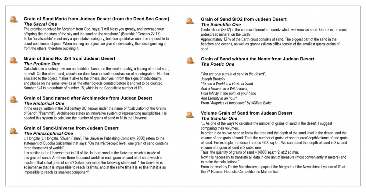
The installation Grains of Sand from the Judean Desert consists of seven identical jewelry boxes, each containing one grain of sand from the Judean Desert. Each grain displays a certain hypostasis of existence (sacral, profane, historical, scientific, philosophical, poetic, and scholarly), and is accompanied by a brief commentary.
For instance, the commentary to The Sacral One reminds us of the promise given to Abraham by God, who said: “I will bless you greatly, and increase your offspring like the stars of the sky and the sand on the seashore.” (Genesis 22:17).To be “incalculable” is not just a quantitative category, but a qualitative one, as well. It is impossible to count dissimilar objects. By naming an object, we give it individuality, thereby distinguishing it from others and outlining it.
The commentary to The Scientific One explains that silicon dioxide (SiO2) is the chemical formula of quartz, which we know as sand. Quartz is the most abundant mineral on Earth.
The commentary to The Philosophical One alludes to a statement by Buddha Shakyamuni: "On the microscopic level, one grain of sand contains three thousand worlds."
Thus, this work shows seven different meanings of one grain of sand.I reflect on how one and the same object can be endowed with different meanings, depending on the context.

* * *
The work My Friend Olive Tree is created in the style of soft-art – a mobile app that serves as a medium for textual communication between the artist and a tree via a purpose-built chat program. The software transforms the digital values of the stream of sounds made by the rustling leaves in real time. This is possible thanks to a unique property of the Hebrew language: Each letter of the Hebrew alphabet has been assigned a unique numerical value. This enables her to reanalyze the stream of digital values as a string of letters.
For the chatting partner, I have selected an olive tree growing near my home. This tree was rescued from death and transplanted in a new location, not far from the spot where it used to grow, in the area of a small town near Jerusalem. It is 2500 years old, and it "remembers" the time when it was surrounded by ancient Hebrew speech. Later, Hebrew ceased to be a spoken language, until its revival in the same land in the late 19th century. Therefore, the speech of this ancient olive tree sounds particularly impressive after being translated into Hebrew.
A simple webcam with a highly sensitive microphone, which has been installed on the branches of the tree, transmits the image of the leaves and the sound of their rustling to the mobile device. The resulting sound graph is then transformed by the software into a stream of digits, which is simultaneously a stream of Hebrew letters. Then, through the use of a special code, this stream is broken into individual words, which appear as a text message in the chat.


-
 Nataliya Kamenetskaya
“The Relationship between Letter Aesthetics and Cultural Identity” conference.
Nataliya Kamenetskaya.
Number & Digit / Letter & Mind
Theses
1. About the project “Point of Reference of the Artist”: Letter & Mind».
Number & Digit, Letter & Mind are the interrelated art projects, developed in the context of the research artistic program “Point of Reference of the Artist”. This program explores subjective vision as an artistic method of analyzing contemporaneity, examines the interconnection and the originality, similarities and diversities of national cultures in different contexts of some basic pictorial and semantic sign systems that record, archive, and change the history of humans, – these systems are based on folklore images and traditions inherent in every national culture. Frame of Reference project was carried out in the development of the program “Art in the Context of Intercultural Communications between the Countries of Eurasia and Asia”, launched in 2015 as the Urbi et Orbi..., Russian-Korean exhibition project for the VI Moscow Biennale of Contemporary Art. Primarily the program was developed to bring together, or exchange works mostly by Russian and Korean artists, and had to takes place in two venues, in Moscow and Gwangju, and to be held online and offline. Our exhibition of multimedia art “Number & Digit” was the last offline joint project in Moscow, it was held both at the Museum Center of the Russian State University for the Humanities as the group exhibition, and as the solo exhibition of the artist Lee Lee Nam at the MARS Center for Contemporary Arts.
Our already realized offline exchange projects could be considered the unpredictable examples of commons, and of diversities of visions and creative collaboration of artists who are separated by geography, language and the cultural specificities of their countries, but who have nevertheless found support for their joint statements analyzing the number and the digit as an abstract alternative to the word.
Thus, the study of symbolic meaning-forming national cultures in the context of interpretations inherent and characteristic of the language of contemporary art in our project is implemented on the verge of two eras before and after the “Coronocene[1]”, in connection with the epidemiological situation in the world of these last two years. Thus, the exhibition "Letter & Mind", conceived as a continuation of this art research project, seems to be shown online first.
In this project, cooperation with the artists, whose work belong to the field of contemporary art is especially important - the language of contemporary art deals with form, content and text, creating unexpected narratives and changing meanings.
The main idea of this exhibition was to expose special art projects by selected artists from South Korea, Belgium, Russia, and Israel, to present by their art some kind of intellectual games by mind, texts, scripts, and “real” visualities, related to different but / and similar approaches to some basic cultural traditions, and individual perceptions, from a point of view of an artist. Thus, the presented works are the result and method of artistic understanding of the peculiarities of the alphabet inherent in a particular culture. The alphabet is very important for peoples with a special destiny and history: Hangul is the phonemic letter of the Korean language, specially created for the people, the alphabet is of a great aesthetic and spiritual significance for the modern Korean culture and for the people of Korea, in cities there are buildings and entire areas decorated with its letters and texts; Hebrew is the ancient language, sacred text of the Torah was engraved on the scrolls by Hebrew letters thousands years ago. Nowadays, Hebrew is the state language of the country of Israel. Despite the different history of the origin of letters and the different times of the granting of writing for the two different peoples, in person I find visual and semantic similarities in spellings, intellectual and internal meanings of letters. Despite the fact that in the Middle Ages in each region of residence of the Jews, when different stylizations of writings appeared, the writing of the Hebrew alphabet has come down to our times, almost unchanged. Hebrew square letters were often used as an architect decor as well. It seems to me especially important for this project is that each letter of the alphabets used here, changes and plays with meanings in connection with images/signs combinations. The letter as a visual symbol often changes the story of events. Hebrew letters are also used to write numbers, each letter is assigned a numerical value (gematria). It’s not by chance, that nowadays, Talmud was published in South Korea, thus Hebrew is considered to influence an intellectual development.
In this project, the European and Russian artists take part with their art research based on writings and games in the field of letters and writings within art space. Thus, the writing of the Russian language is based on the Old Slavic Cyrillic alphabet, the words were formed according to their own models and borrowings. The meanings of words depend a lot on the conceptual social context. In these cases, this project presents artworks, that use both the decorative-visual meaning of letters, canceling, transforming or adding meanings, and the conceptual meaning of the text, which creates an additional narration. Similar functions of language and text in contemporary art relate to a large extent to the Latin alphabet, and here I will refrain from linguistic analysis.
2. Some of the projects on this subject are already shown at this Art-platform current exhibition. It seems preferably for me to start the presentation of the some of the Letter & Mind projects with the sculpture of An Kyeongmi. In 2012, two of her sculptures, white vases with verbal visual designation of the path were presented at our first Korean-Russian art exhibition at the RGGU Museum Center in Moscow. These vessels prompted me to think about the varieties of visual meanings of text in art, and of the beauty of the Korean alphabet. The vessels made by the artist, combining the traditional form and the Korean alphabet, thus contained and represented the ideal and static, materiality with a certain symbolic movement, expressed in certain texts of the Korean script.

An, Kyeongmi (Korea)
Vassels. 2013. Bronze. 32x27 cm
The Korean artist Jungsuk Noh works with visual, and at the same time with verbal, folk, emotional, and spiritual senses of the alphabet. So she comments her artworks «Love», and «Good Luck 2):
“It represents both hotness and coldness in love. The Korean alphabet ‘ㅅ’ expresses two people who are supported by each other, which is also the characteristic of love. The Korean alphabet ‘o’ implies the Asian concept of the eternal cycle of birth, death and rebirth. With the open mind of the Korean alphabet ‘ㄹ’, it symbolizes love.”
“In Korea, people often say “Get a lot of good luck! (복 많이 받으세요!)” instead of “Happy New Year!” as new year’s greeting. The Korean word ‘복’ means ‘good life and happiness’ – that is to say, if you hear this expression from Korean people, they hope you to have good fortune in your life. On the way to Art, we should share a lot of 복with many people and be together.” Но Чонсук.
 Jungsuk Noh
Good Luck 2(복 2)
250x250mm
Acrylic on canvas, 2019

Jungsuk Noh, Love (사랑)
530x455mm, Acrylic on canvas. 2020
The installation Book was created by Maria Ovchinnikova as the additional text, illustration, and sculptural composition for one of the chapters of the Book of Judges[2]. The Hebrew text is composed with the Hebrew letters made in ceramics.

Maria Ovchinnikova. Book. Installation. 2020.
My Friend the Olive Tree is the project by Israeli artist Galina Bleikh in the style of Soft-Art – a mobile app that serves as a medium for textual communication between the author and a tree in a purpose-built chat program. The software transforming the digital values of the stream of sounds made by the rustling leaves in real-time is based on a unique property of the Hebrew language: each letter of the Hebrew alphabet has been assigned a unique numerical value. This enables her to reanalyze the stream of digital values as a stream of letters. For the chatting partner, the artist has selected a 2500 years old olive tree growing near her home "remembering" the time when it was surrounded by Hebrew speech.

Galina Bleikh. My Friend The Olive Tree. Mobile application
Installations of Alexandra Dementieva have been inspired by ideas of perceptual communication, the nature of seeing, hearing and our ambivalent feelings toward reality. Apart from using technology almost exclusively as her modus operandi, she constantly
educates her viewers about their perceptual habits and the feelings connected to them. The more she is able to perceive imagery and discern words from the initial cacophony of sound.strategies of interpretation, a work that could be called “no man’s land”, individually inaccessible to art or science. science is presented as an object not of representation, but of an artist’s imagination. Are the creative methods presented in the works a scientific experiment? Or
Or sham science. Or the stimulation of creativity. Interpretations are infinite, transformation’s limitless, logic illusory.


Аlexandra Dementieva.
Inland realm. Interactive installation. 2020.
The project of the Russian artist Tatyana Antoshina (the author) in this project symbolizes the transition between these sometimes opposed sometimes the same worlds, of numbers and of letters.
The image of a radio dial is projected on the floor in the corridor of the exhibition hall. By moving along the scale, the visitor serves as a mediator, tuning in to one or another radio wave. The digits indicate radio stations. Moving along the digits, a person tunes into the sounds of various cities and countries, listens to the voice of the planet. This installation provides a new view into one of the methods of virtual travel, giving figural expression to a literal form. Radio Day is on May 7 in Russia. On that day in 1895 the Russian scientist Alexander Stepanovich Popov demonstrated the world’s first radio receiver.


Tatyana Antoshina, Antokhio Vj, Alexey Tobashov
Radio Day. Interactive installation, dimensions variable. 2018.

 Alexandra Kim. Graphite on paper, 59x84cm, mechanical writing / calligraphy. 2020
 Michael Elisha Wogman
Readings. Graphics, objects, installation. 2021
In this Gregorian year, I came up with and began to try to develop a new - graphic - form of poetry, where the role of letters would be in the first place (in comparison with the dominance of sound in classical European poetry). The textual-visual objects obtained in this way - they resemble the "skeletons" of poems by Jacobson and the formalists - I called "reading rooms" because they plunge the viewer into a maze of incorrect readings. Michael Elisha Wogman
[1] Assuming Distance: Speculations, Fakes, and Predictions in the Age of the Coronacene, reference to the Garage museum exhibition, Moscow, 2021.
[2] The Book of Judges of Israel (ספר שופטים) - the part of the Hebrew Bible
-
 Sarah ChoRelationship between Letter Aesthetics and Cultural Identity
Focusing on the Gwangju Biennale
Ⅰ. Introduction
As Marshall Mcluhan explained the essence of media with the formula of human expansion, media appeared at every inflection point in human history and led social change.
In particular, it is no exaggeration to say that the oldest medium in human history is letters. The first letters emerged in the Sumerian culture around 4000 B.C., and the Greeks made alphabets used in Europe in the 8th century B.C. The alphabets were remodeled by the Romans later and eventually developed into today’s alphabetic letters.
Since Johannes Gutenberg invented the metal type typography in the 15th century, letters has been able to spread throughout society, and reading and writing skills have defined the sustainable development of human culture. In the 17th century, newspapers and megazines, made by the typography, let the civil public sphere possible and became the foundation for civil society growth.
In other words, as Marshall Mcluhan generated the concept ‘The Gutenberg Galaxy’ to call the widespread impact that started from the invention of the typography and influenced human culture and society, language and thinking of human culture could be expanded, and studies and theories could be formed since letters had been introduced and distributed over a long history.
Norbert Bolz declared ‘Farewell to the Gutenberg-Galaxy of Letters’ with the appearance of various online media in the 20th century but explained that it meant the loss of the dominant roles of letters and books as a means to deliver information and knowledge, not the disappearance of letters themselves. Video monitors appeared as the main memory space instead of papers, but letters formed multi-layered meanings and variations by combining with images in the fields of visual culture and arts.
This presentation aims to seek the ‘Relationship between Letter Aesthetics and Cultural Identity’ by focusing on the Gwangju Biennale that has the largest scale in Asia. The Gwangju Biennale was established to overcome the wounds of the city with the Gwangju democratization movement in 1980 as a starting point. Its first event in 1995 had 1.63 million visitors and made contemporary art sprout. It has acted as the driving force for the visual culture field for 26 years. After the Gwangju Biennale, the biennale emerged as a new art institution, having many exhibitions in Asia. In 2014, Artnet selected the Gwangju Biennale as one of the world’s top five biennales. The aesthetic discourse embodied in the Gwangju Biennale will be meaningful as a barometer of contemporary art. I will extract the artworks that used letters by borrowing the analysis of the Gwangju Biennale’s all-time artworks in my doctoral dissertation “A Study on the Identity of Asian Contemporary Art through the Gwangju Biennale”, thereby finding out the relationship between letters and cultural identity.
Ⅱ. The analysis of the artworks using a letter medium among the Gwangju Biennale’s all-time artworks
According the basic direction of the establishment of the Gwangju Biennale, it has presented its own discourse every forum by realizing the organizer’s exhibition strategy in a visual way. In the 1990s, it actively discussed about the theories of postmodernism and post-colonialism. It often utilized postmodernism at the beginning and also adopted post-colonial resistance discourse to criticize Western modern colonialism and system.
Based on this theoretical foundation, I classified 1,313 artworks of the Gwangju Biennale from the 1st to 11th events according to themes. As a result, the theme ‘discovery of arts and humans, relations, and life’ was the highest at 34.6%, followed by the theme ‘consideration to their domestic politics, history, and identity’ 20.3%, the theme ‘resistance to power and imperialism’ 15.8%, The theme ‘criticism of existing systems and stereotypes’ 12.4%, the theme ‘opposition to development-oriented industrial society’ 9.7%, and the theme ‘reflection of contemporary society’ 7.1%. Among the 1,313 all-time artworks of the Gwangju Biennale, the total 115 artworks were visualized and embodied by using letters.
When classifying the 115 artworks according to themes, 26 artworks had the theme ‘resistance to power and imperialism’, followed by 24 artworks ‘discovery of arts and humans, relations, and life’, 22 artworks ‘consideration to their domestic politics, history, and identity’, 17 artworks ‘opposition to development-oriented industrial society’, 15 artworks ‘criticism of existing systems and stereotypes’, and 11 artworks ‘reflection of contemporary society’. In other words, the 115 artworks mainly tend to use letters to resist imperialism and consider their domestic politics, history, and identity.
When classifying the themes of the 1,313 artworks according to areas, Asian artists had the highest percentage of the theme ‘consideration to their domestic politics, history, and identity’ and the third highest percentage of the theme ‘resistance to power and imperialism’. On the other hand, in Western countries such as Europe and North America, the theme ‘consideration to their domestic politics, history, and identity’ was relatively low but the theme ‘discovery of arts and humans, relations, and life’ was the highest and showed various themes at the same time.
Based on this result, when classifying the 115 artworks, visualized by using letters, according to areas, Asian artists were the highest at 44.3%. In other words, the 115 artworks mainly tend to use letters to consider cultural identity, resist imperialism, and find their own identity.
<The number of the letter-based artworks among the Gwangju Biennale’s all-time artworks>
Theme
the number of the all artworks
the number of the letter-based artworks
the proportion of the all artworks
the proportion of the letter-based artworks
opposition to development-oriented industrial society
128
17
13.3%
14.8%
resistance to power and imperialism
208
26
12.5%
22.6%
criticism of existing systems and stereotypes
163
15
9.2%
13.0%
discovery of arts and humans, relations, and life
454
24
5.3%
20.9%
consideration to their domestic politics, history, and identity
267
22
8.2%
19.1%
reflection of contemporary society
93
11
11.8%
9.6%
Total
1,313
115
8.8%
100.0%
<The number of the letter-based artworks according to areas>
Areas
the number of the all artworks
the number of the letter-based artworks
the proportion of the all artworks
the proportion of the letter-based artworks
South America
105
4
3.8%
3.5%
North America
182
9
4.9%
7.8%
Asia
468
51
10.9%
44.3%
Africa
57
5
8.8%
4.3%
Oceania
21
4
18.7%
3.5%
Europe
421
40
9.5%
34.8%
Middle East
58
2
3.4%
1.7%
Total
1,313
115
100.0%
Ⅲ. The analysis of the major artworks that represented identity through letter aesthetics
The correlation between art and human identity has been explored throughout the history of art. The fundamental questions about human identity – such as how the world looks at me, how I look at myself, and how I look at others – have influenced thoughts, emotions and creative expressions of artists. The topics, formal characteristics and materials of artworks reveal the features of identity at a wider cultural level along with an individual level. When artists and theorists use the term ‘identity’ in art, it generally means social and cultural identity. Contemporary artists who are interested in the theme of identity ask not only who I am as individuals but also who we are as members of society. When these identity questions are raised, letters are functioning as the device and process to strengthen the identity of artworks in virtue of their clarity and cultural originality.
1) Shaping the cultural identities of their own countries
Among the Gwangju Biennale’s all-time artworks, the artworks with the theme ‘consideration to their domestic politics, history, and identity’ mainly tend to represent the traditions of their own countries, such as values, languages, and folklore, through contemporary formative senses, or evoke their colonial history through letters.
In particular, with the theme ‘discovery of the East’, Asian artists actively emphasized the letter medium when exploring both the oriental values such as the unity of the ego and the outside world and the monistic oriental view of the world such as combination and balance, rather than the dual western view of the world such as trandition and present, life and death, and mental world and material world.
Seonggeum An’s artwork “Sound of Buddha(1994)” <Image 1> placed sound and noise, silence and talk, writing and landscape, and abstraction and figuration. It showed the circular movement of Mandara by mixing language with images and music. The densely-printed letters functioned as the device to reveal the traditional oriental ideas and values.

<Image 1> Seonggeum An, “Sound of Buddha”

<Image 2> Lu Sheng-Zhong, “Poetry of Harmony”
 <Image 3> Anwar Shemza, “Abstract Writing”
Lu Sheng-Zhong’s artwork “Poetry of Harmony(1991)” <Image 2> is a metaphor for Chinese folk art and political situations in reality. In ancient China, the paper written with letters was considered as the noble and elegant thing that should not been thrown away carelessly. The artist explained that the letter-written paper represented a sort of cultural wisdom, so the act of burning the collected papers after washing and drying them one by one was one of Taoism’s lessons and eventually left something in human mind and spirit.
Anwar Shemza’s essential theme was language and writing. His artwork “Abstract Writing(1969)” <Image 3> used lyrical patterns and calligraphy style, which was based on geometric forms derived from Islam and Asian culture. Shemza lived in the UK, but his artworks continued to be affected by Pakistan and India.

<Image 4> Gu Wenda, “United Nations-Canadian Monument: the Metamorphosis”

<Image 5> Miguel Angel Ríos, “Huellas del Colonizaje”

<Image 6> Eko Nugroho’s embroidered artworks(selection)
The Chinese artist Gu Wenda, who has been a front-runner in the field of avant-garde art in China since the 1980s, has participated in letter-based art. Her letter-based art destroys important structure of the Chinese-language system but retains aesthetic characteristics of calligraphy while preserving the appearance of Chinese characters as calligraphy. The installation artwork “United Nations-Canadian Monument: the Metamorphosis(1998)” <Image 4> made the avant-garde and dramatic space where the formative beauty of the traditional calligraphy and human hairs were in harmony. Although it used the traditional Chinese method named ‘Seoyeh(書藝)’, it reflected the art world where the East and the West were in harmony, such as the formativeness and abstract beauty of Chinese characters and the collage technique using hairs. The artist suggested a new utopia beyond the confusion of the East and the West, racism, and the conflict between globalization and nationalism.
Miguel Angel Ríos’s “Huellas del Colonizaje(1992)” <Image 5> was made based on the map of South America produced by colonial rulers. It represented the aesthetic state of combination by reconstructing places in the map, changing their locations randomly, and reversing them. It expressed both the geological locations and the cultural identity of the region due to the political background in South America through the letters in the map, and suggested the possibility of writing the de-colonial history.
Eko Nugroho from Indonesia made hilarious and sharp comments on Indonesia’s recent history of politics, culture, and society, especially after the ‘domination by the iron fist’ of the president Suharto for 30 years collapsed. His embroidered artworks <Image 6> expanded their meanings by criticizing the urban history that inherited the anti-colonial struggle, cultural heritage, and strong community spirit in short sentences. They introduced characters from the traditional local puppets and dealt with poverty, social inequality, religious insanity, and corruption as their themes.
2) Establishing identity as resistance to power and imperialism
Post-colonialism argues that Western identity or status are wrong because they assume their identity or status as everyone’s prototype and do not consider cultural differences. In fact, the term ‘post-colonialism’ itself evokes the imperial history while presenting resistance and de-colonialism. It is indissolubly linked with political struggles around the world, de-colonization in many countries since the Second World War, and the struggles for racial or ethnic equality in all parts of the world.
The artworks with the theme ‘the scars by imperialism and colonial domination’ revealed the criticism of imperialism and the pain under the rule of colonization through the letter medium as direct or metaphorical signifiers. The letters were used as the means to show American hegemony and international inequality, conflicts over the remnants of colonization, and anxiety and confusion of the ruled class by colonial pillage. The critical messages on imperialism were more strengthened by juxtaposing the language system and visual medim such as paintings.

<Image 7> Jeongheon Kim, “the Panmunjeom Restaurant established by Disney”

<Image 8> Brenda Fajardo, “Crossroads”

<Image 9> Gorden Bennett, “Notes to Basquiat”
The painting “the Panmunjeom Restaurant established by Disney(1995)” <Image 7> of Jeongheon Kim, who has participated in a public art movement and worked as a member of the group ‘Reality & Utterance’ since 1980, expressed the cultural imperialism through the Walt Disney and the tragic situation of Korea as the divided country through the Panmunjeom in his own formative way of language. His formative way of language has the characteristic to develop narratives by arranging and contrasting figures. He showed the relationship between South Korea and North Korea and U.S. involvement in the painting, and doubled the tension and dramatic effect by expressing the Panmunjeom through alphabet letters.
Brenda Fajardo from the Philippines has raised the issues related to women in the culture and history of the Philippines. His series artwork “Crossroads(2003)” <Image 8> that consisted of five panels of 122.25x90cm each were about the relationship between the United States and the Philippines. The five panels were integrated into one by the ancient cursive letters ‘Alibata’ that was popular among young Filipinos. The blue and red wave banner was the device to connect them into a single narrative and functioned as the element to maximize resistance, hostility and historical scars of the Philippines to American imperialism. The uncle Sam, the symbol of American imperialism appeared throughout the whole series, and each canvas was drawn the moments when Filipinos struggled against the legacy of the American Empire.
Gorden Bennett, who became a member of society by being raised and educated as a white Australian, has investigated the relationship of racial epitome, power, and knowledge that governs the historical portrayal of natives within contemporary Australian society. The artwork “Notes to Basquiat(1999)” <Image 9> explored indigenous heritages and studied how they were mixed with colonial history and reality. It showed the conceptual painting based on the application of semiotics and paintings, the juxtaposition of images and texts, and so on.

<Image 10> Ikjung Kang, “The landing of the United States”

<Image 11> Xu Bing, “Square Word Calligraphy Classroom”
 <Image 12> Candice Breitz, “Karaoke 2000”
Ikjung Kang, Xu Bing, and Candice Breitz dismantled and criticized the English language, the symbol and foundation of imperialism, given that language is a source of knowledge, and power is formed centering around knowledge. In other words, language appeared not only as an iconic signifier but also as an entire page in terms of content.
Ikjung Kang’s “The landing of the United States(1997)” <Image 10> revealed the direct criticism of American imperialism and hegemony. It consisted of 1,400 drawings of 12.7x17.78cm each and the 274.32cm chocolate-coated statue of General Douglas MacArthur, the Korean War hero. The drawings were covered with hand-written red small-letter English words and blue Korean words that was the meanings of the English words. The artwork contained the artist’s actual experience of memorizing English words in a small canvas while studying in the United States. For the person from the week country, English was the means to survive fiercely in the United States. The criticism of American imperialism contracted the grief of the week country that had no choice but to go along with the imperialism.
The artwork “Square Word Calligraphy Classroom(1995-1997)” <Image 11> of Xu Bing, one of the leaders of Xinchao that started in 1985 as Chinese avant-garde art, displayed various learning tools such as videotapes in the classroom. Audiences transcribed Western alphabets into square words, which were invented by Xu Bing, by using the calligraphy coursebook, ink stick, and brush on the desk while watching a demonstration tape in the real classroom. They could experience the co-existence and confusion of the Western words and the Eastern words by writing the square words in calligraphy by themselves. The square words, which were invented by the artist, were the system in which all letters of the Western alphabets had signs in Chinese calligraphy corresponding to them so each word could be transcribed into Chinese letters similar to Chinese characters. The artwork modernized the woodcut and the calligraphic handwriting, which was important characters in Chinese tradition, which mentioned the importance of the traditional Chinese characters given that contemporary power is based on knowledge.
The key point of Candice Breitz’s “Karaoke 2000” <Image 12> is the morphological similarity between a Karaoke that is one of entertainment forms and a language cassette that is used for millions of people to learn languages. Learning a language is, at the same time, to absorb the cultural, social and national values inherent in the language. This is more serious, especially in the case of English that has been functioning as an imperialist force for a long time. The artist actively used letters as the device to criticize English imperialism.
Ⅳ. In conclusion
As a result of analyzing the ‘Relationship between Letter Aesthetics and Cultural Identity’, letters were used as the element to strengthen messages on cultural identity in the visual medium.
As a result of analyzing the letter-based artworks among the Gwangju Biennale’s all-time artworks, they reflected the situations of the times such as history, society, and economy by using letters as a signifier or an icon in the visual medium, and visualized the discourse of the community by putting the brakes on the Western central system. With letters, the artworks mainly tend to represent values, folklore and traditions of their own countries through contemporary formative senses or evoke their colonial history.
In particular, identity was a crucial subject for Asian artists who had experiences of colonization. They, through letters, maximized political, social and economic problems of their own countries and historical affairs and experiences in Asian modern and contemporary history. They dealt with the whole issues of their own countries from political issues to maintain the ruling system, such as public struggle for democracy, and dictatorship and violence of the government, to socio-economic issues, such as confusion in the process of accepting Western civilization, civil war, racial conflict, women exploitation, corruprion and pillage of the powerful, and the gap between the rich and the poor. letter aesthetics stood out as the device to strengthen their messages. Also, the artworks that strived for de-centralization by breaking down the Western-centered worldview symbolized by the Western language, namely English.
It is possible to raise the question about the validity of cultural identity in the era of globalization. However, it is indispensable to explore contemporary roots, just as the Thailand artist Rirkrit Tiravanija, who participated in the 1st and 9th Gwangju Biennale, gained international reputation for his artwork using his domestic materials such as Thai food.
Especially, from the perspective of post-colonialism, Bell Hooks, Edward Said, Homi K. Bhabha, Gayatri Chakravorty Spivak, etc. had discussed identity in more complex languages until the 1990s. They argued that identity was not built or dominated by a single key variable such as race, but it was organized in a complex matrix of various variables such as gender, sexuality, ethnicity, class, religion, community, and nation.
In the process of hybridization in the era of globalization, the question ‘how can we understand the reconstruction of racial, regional and ethnic identities?’ still remains a challenge. We need to reconsider identity from today’s multi-directional perspectives, and the research of the ‘Relationship between Letter Aesthetics and Cultural Identity’ would be meaningful as the opportunity to consider cultural identity from the perspective of the letter aesthetics.